In this activity, I decide to use the accessibility checklist by Micro Assist (2017) to evaluate the website I created last semester.
Here is the link to the website: https://junxlearning.wixsite.com/eddl5101-final
Navigation
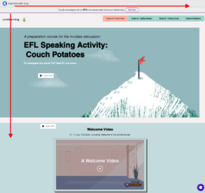
The website can be fully accessed via using the keyboard. As the tab order is coded to reflect the logical page layout, users can press the tab button to select all the elements on the website from left to right and top to bottom, as presented in Image #1. Because there is not too much content on the website (no drop-down lists in the menu section), the skip navigation link seems less significant. But adding the skip navigation link can still enhance the accessibility of the web for keyboard-only users.
The landmarks are used to identify different web page sections: menu bar, main content, and footer.

Image#1
Content structure
Titles, headings, and lists are used to present differently for different page topics and secondary sections.
Hyperlinks
The hyperlinked text is written out rather than as web addresses. Links are presented with different fonts or font colours; some even have the relevant icon to indicate the linked destination or file type. However, texts like “click the button” and “let’s go” are used, which might seem less meaningful. The linked destination could be presented next to the link to improve accessibility.
Text
Font size can be enlarged and diminished by the users, and the contrast ratio of the font colour and the background colour is above 4.5:1. But some of the parts fail to meet the standard.
Images
Most images have alternative text for descriptions. Some decorative images might be redundant, which could be distractive for learners.
Forms
The contact form is easy to navigate and has accessible instructions showing what information is required for each input field.
Documents and Other Files
The pdf files also follow the basic accessibility guidelines.
Multimedia
Most videos are from YouTube and have built-in captions, but the welcome video has no caption. Captions for videos are important not only for users with auditory impairment but also for people who cannot listen to the audio under some circumstances. But at least, an audio version of all the text on the webpage is available for users in need.
Adaptability
The website is responsive to smartphones. Due to some technical limitations, it does not support every screen size on desktops and laptops.
Policies, Processes, and Maintenance
Some of the embedded content has been expired or not available for now. It needs frequent updates and maintenance to continue being accessible.
References
Microassist. Accessibility checklist: 10 critical areas to evaluate for website accessibility. Digital Accessibility Digest.
https://www.microassist.com/wp-content/uploads/2017/02/Microassist-Accessibility-Checklist-ACC.pdf


Leave a Reply
You must be logged in to post a comment.