1. Learning outcome measured by the assignment
Students will identify the difference between the four tennis Grand Slam tournaments and understand the basics of using digital tools to create infographics.
2. Short, descriptive title
The Four Grand Slam Tournaments
3. A plain-language purpose for the assignment
The purpose of this assignment is to reinforce your comprehension of the Grand Slam tournaments and apply it to create a detailed infographic for presenting your understanding to the people who would like to know more about the tournaments.
4. A narrative description of the deliverable(s) that includes two or three of the criteria items (that would be used in an assessment rubric)
- The information presented in the infographic is accurate and complete.
- Creativity and quality of the design are delivered.
- Visual literacy (Typography, color, and contrast).
- Presentation delivery.
- Team collaboration.
5. A detailed set of instructions for the project, its steps, and process(es)
- The first discussion – students talk about the tennis tournaments (relate to prior knowledge).
- Decide the most relevant and popular information they would like to know about a Grand Slam tournament.
- Create a list of questions and information discovered in the project (an info template is set).
- Form four groups of 4 or 6 students, and each one selects one of the four Grand Slam tournaments as their group topic.
- The second discussion – students update the work process and share challenges or tips found in the project. (peer feedback)
- Students work on the projects.
- Final presentation and the final portfolio.
6. Team or individual responsible for the project (or for specific steps of the project)
Students can decide their responsibilities based on their preferences or skills.
For example, one student is mainly responsible for team management and presentation, and one for developing ideas of the design and monitoring the design quality, and the other one for collecting and sharing information and proofreading.
7. A timescale for the project
Two weeks will be given for the research, production, and presentation. One week before the final presentation, a second meeting will be held.
Activity 5
Rubric
| Components | 4—Excellent | 3—Good | 2—Fair | 1—Needs Improvement |
| Concepts | The topic of the infographic well presents all of the required information and is highly aligned with the purpose of the project. | The topic of the infographic presents most of required information and is well aligned with the purpose of the project. | The topic of the infographic presents some of required information and is almost aligned with the purpose of the project. | The topic of the infographic presents only little of the required information and is barely aligned with the purpose of the project. |
| Research and information accuracy | Final product reflects research done beyond what was required and the information is accurate. | Final product reflects adequate research, and all of the information is accurate. | Final product reflects some research, and most of the information is accurate. | Minimal research was done, and some of the information is inaccurate. |
| Creativity and quality of the design | The overall design is extraordinarily creative in terms of the graphic used and layout. Message is clear and compelling. | The overall design is creative in terms of the graphic used and layout. Message is clear. | The overall design is acceptable; but could be improved through better layout and graphic presentation. The message is slight unclear. | The overall design is unorganized and distractingly. The message is absent and contradictory. |
| Typography | The infographic includes an appropriate font to both complement the content and make the text readable. | The infographic includes the font to make the text readable and relevant. | The infographic includes multiple fonts and/or the fonts do not seem related to the infographic topic. | The font(s) used in the infographic make the text almost unreadable. |
| Contrast and color | All of the white space is used strategically, and the color used to enhance the meaning of the work. | Most of the white spaces are used well, and colors are used appropriately. | The use of white space could be enhanced. Color choices could be improved to support the design. | Lack of contrast due to the poor of white space and imbalanced color combination. |
| Presentation delivery | • Holds attention of entire audience with the use of direct eye contact, seldom looking at notes
• Speaks with fluctuation in volume and inflection to maintain audience interest and emphasize key points |
• Consistent use of direct eye contact with audience, but still returns to notes
• Speaks with satisfactory variation of volume and inflection |
• Displays minimal eye contact with audience, while reading mostly from the notes
• Speaks in uneven volume with little or no inflection |
• Holds no eye contact with audience, as entire report is read from notes
• Speaks in low volume and/ or monotonous tone, which causes audience to disengage |
| Team collaboration | Routinely provides useful ideas when participating in the group and in classroom discussion. A leader who contributes a lot of effort. | Usually provides useful ideas when participating in the group and in classroom discussion. A strong group member who tries hard! | Sometimes provides useful ideas when participating in the group and in classroom discussion. A satisfactory group member who does what is required. | Rarely provides useful ideas when participating in the group and in classroom discussion. May refuse to participate. |


Rolly de Juan
Hi Junxiang,
Thanks for sharing your activity. This is a good topic with a lot of research and creative opportunities!
Since this is a group project, I think it would be good to provide more details about the presentation platform and to specify the deliverable style, i.e. whether it is synchronous or asynchronous.
I like how your rubric is comprehensive with detailed elements in your levels of achievement. I suggest placing a grade component i.e. how much each element is worth and what the project is weighted.
Good work!
Rolly
bgilligan
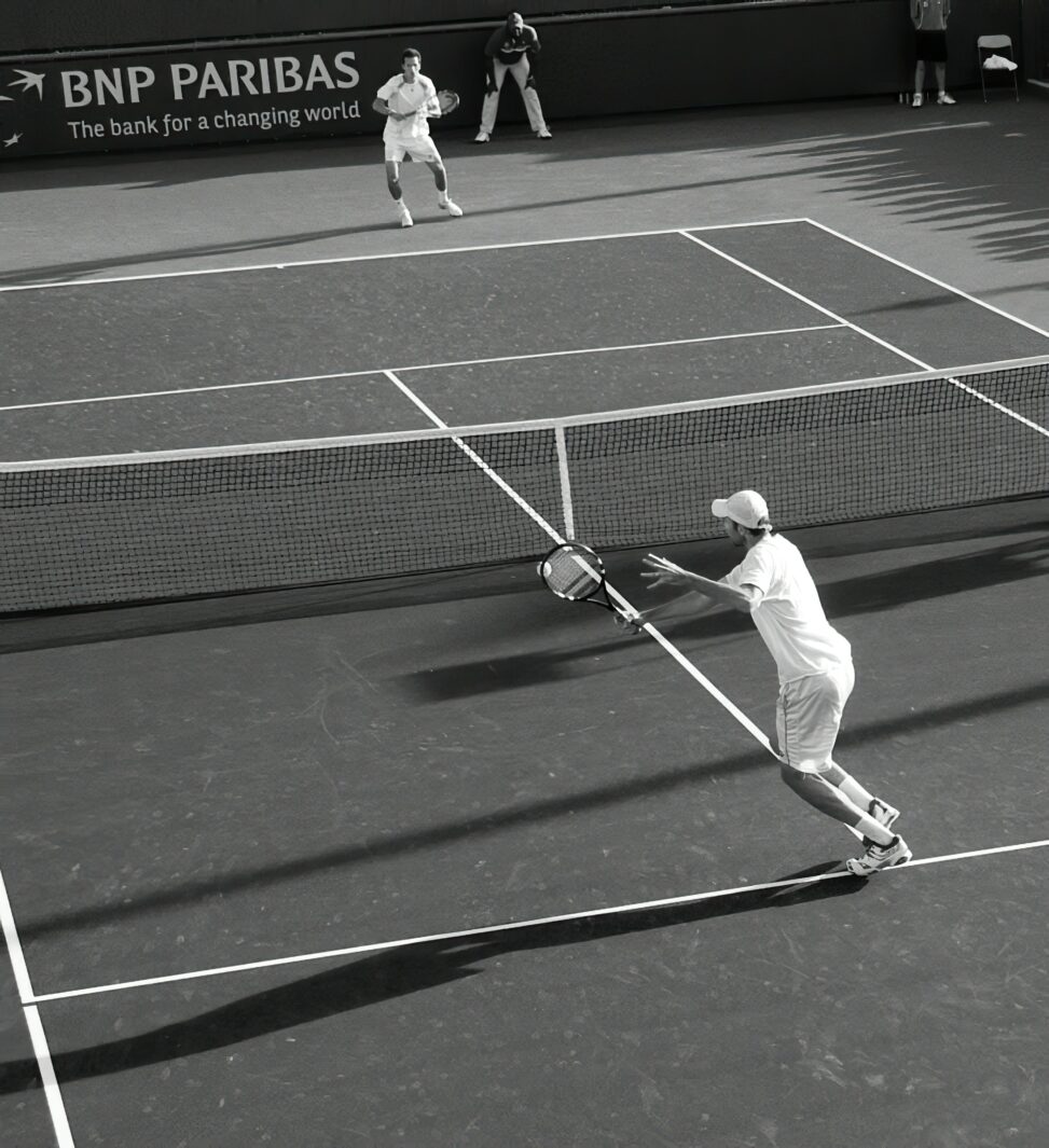
Wow, very thorough. It may be a little too much for anyone who might be looking at this as a new tennis player though. On suggestion might have been to crop the opening image in such a way as to more effectively draw the viewers eye down.