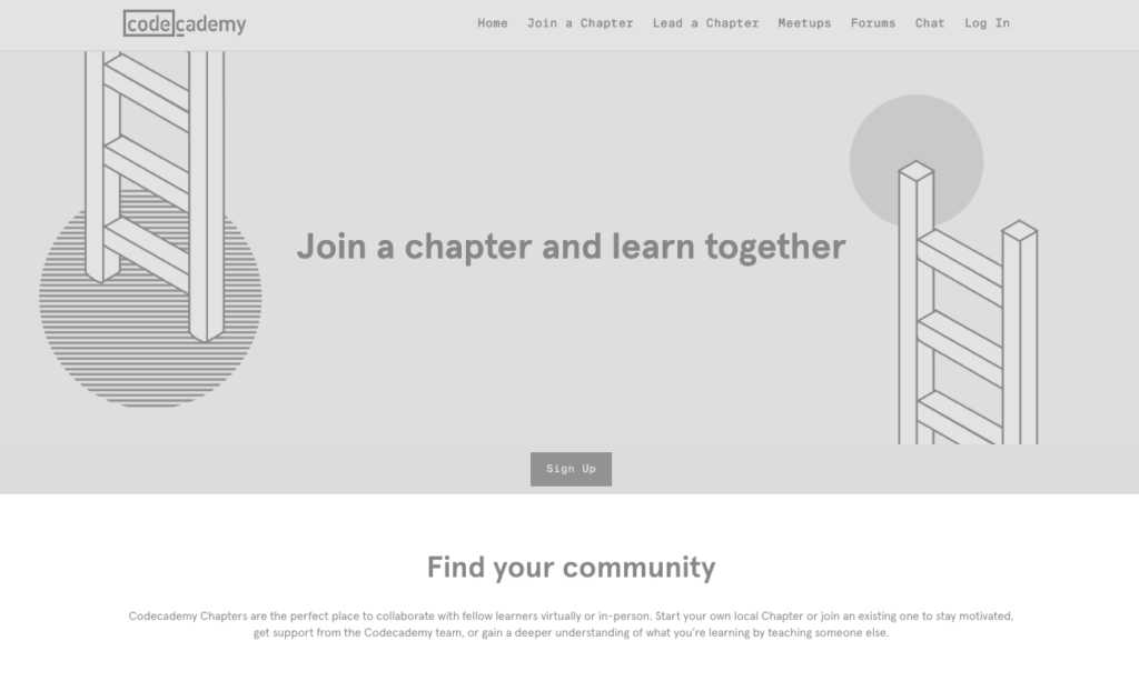
For this activity, I choose to use another programming learning platform – Codecademy. I have to admit that the effects brought by the No-Coffee extension really shocks me. Before this activity, I had no idea how difficult it could be for people with a vision impairment to interact with the web content.
The original webpage:

after applied NoCoffee (contrast lost and achromatopsia):

After applying the No-Coffee extension to Codeacademy, all the appealing color contrast and aesthetic design are gone. It reinforces my understanding of why we should avoid using colors to identify necessary instructions on a web page. For people with pervasive disorders, the website would be impossible to use, as Codeacademy uses a black background for most interactive content. For people with blocked vision impairment, it would be tough to navigate through the website.
Even though some users have access to the screen reader, it would be better if the website has a screen reader function available and specially designed for a particular situation just in case if the function of the screen reader is not compatible with the content design. It might sound unrealistic from a commercial aspect, as this website is designed for specific users and customers. Due to this reason, educators need to have the ability to select appropriate educational resources for students with careful evaluation from the perspective of accessibility and inclusion.

Grace Landreville
Hi Junxiang,
I was also shocked by some of the effects of NoCoffee. It helps reinforce accessibility for all. I agree that even though websites are compatible with screen readers, other functions could be made available for specific situations. The website I choose to try out has some accessibility settings you can change but if you have a visual impairment, they are hard to locate to actually change. As a person who seems to be quite experienced with programming, do you think this could be something that could be made even more accessible?
Thank you for sharing your post!
Junxiang
Hi Grace, I think you have asked a good question. I believe there are many frameworks guiding the programmers to build the website or Application in a more accessible way. But, in the commercial marketing dominated world, it is hard to create a product for non-profit purpose. Let’s hope that technology will bring more accessibilities to all people. Thanks for your sharing!
Ryan MacGregor
Hello!
It is amazing how the contrast shifts when a monochromatic filter is applied. Not only is the visual interest redundant, but the ability to discern shapes for reading is vastly reduced. I wonder how the reinterpretation affects assessment, and as you mentioned, the use of colour to emphasize text or information. It would be interesting to study the interrelations of visual memory, colour, and retention!
Thanks for sharing,
Ryan