Activity 3: Crop a Photo
The original image:
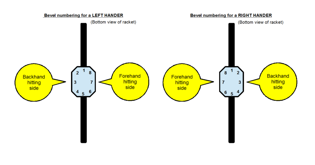
“File:TennisBevels-PNG.png” by Tavernsenses is licensed with CC BY-SA 3.0.
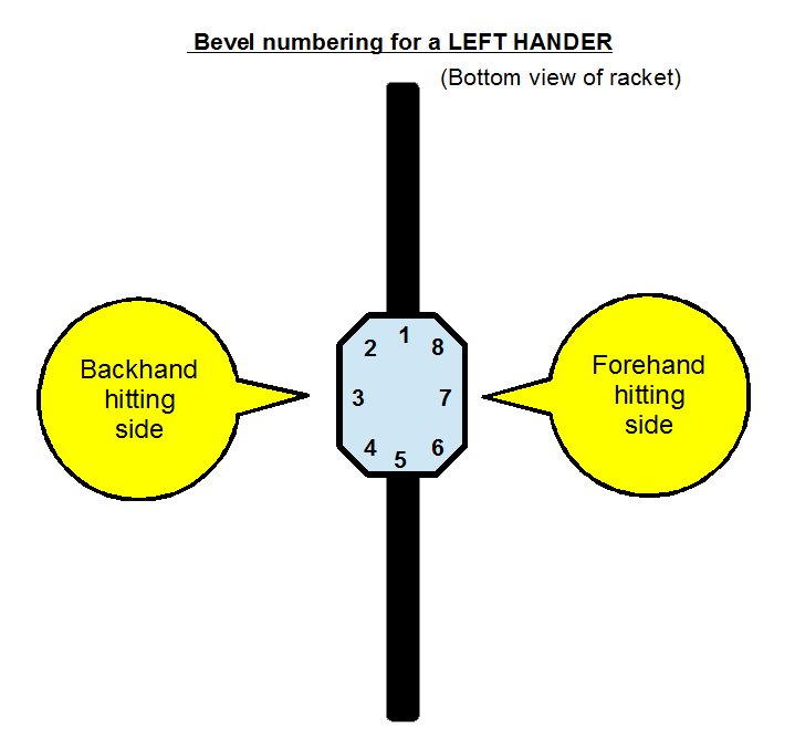
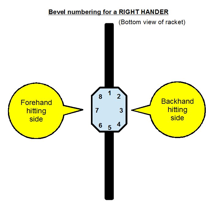
The images I cropped:
“File:TennisBevels-PNG.png” by Tavernsenses is licensed with CC BY-SA 3.0.
“File:TennisBevels-PNG.png” by Tavernsenses is licensed with CC BY-SA 3.0.
URL: https://creativecommons.org/licenses/by-sa/3.0
I found this photo on creativecommons.org. It has also been used by Wikipedia to present the eight bevels (sides) of a tennis racquet. I used Photopea to crop the photo, and the workflow was straightforward–upload, crop, and export the final work. The platform–Photopea–is like an online version of Adobe Photoshop with powerful photo-editing features. It was handy when dealing with simple tasks.
The Reasons for Cropping
First of all, this image seems to present the eight bevels for both the right-handers and left-handers, but it contains too much information in one single image. For example, I am a right-hander, and my first reaction when seeing this image is to find which one is for my situation (looking for the right-hander area). This process already confused me since both sides of the graphic looked comparable.
The Theory for Cropping
As discussed above, the image consists of two sides with the same graphic, and only the texts are slightly different. The whole image contains extraneous information for both right and left-handers. I didn’t mean that people don’t have to know the information which is not directly related to them. But the image could be cropped into two for a more straightforward presentation. According to Mayer’s coherence principle (2014, p. 390), it would be better to reduce extraneous information if the right or left handers are presented separately in two different images. Also, based on the spatial contiguity principle (p. 392), people learn better when the corresponding words and pictures are presented together at the same time. Since the words and graphics are already put pretty close to each other, which is good, there is no need to put them together to generate confusion. At least, the two sets of graphics should have more white space in between.
So that is why I crop it into two graphics, and each of them presents just one piece of information (about right-hander or about left-hander).
Activity 4–Resize an Image
Click the thumbnail to view the full-size image (cropped).
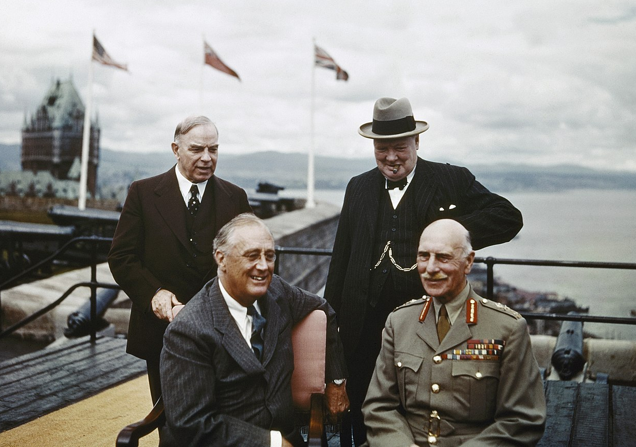
The Quebec Conference Canada, August 1943
Activity 5: Create a Graphic
Learning outcome: students will be able to identify the basic elements of a tennis court, especially the difference between singles sideline, doubles sideline, and service line.
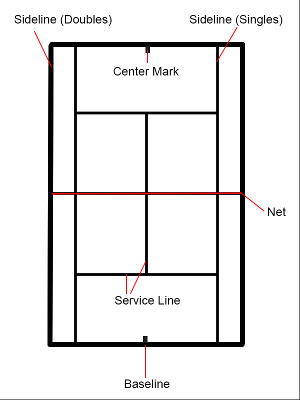
I used Sumopaint to create the tennis court outline and then add the text and the red indicating lines using Photoshop. Although the Sumopaint is free and convenient to use, it has some limitations: I cannot create more than three layers so that I could not add as many textual labels as I want.
The theory I referred to create this graphic was from Mayer’s (2014) Multimedia Instruction. I try to keep the graphic simple: just the outline of a tennis court with some solid red lines and texts. There is no graphic existing for decoration, which follows the Coherence principle (p. 391). Although I didn’t highlight any text in bold, the essential texts are indicated by the red lines, which are the only color elements in the graphic except black lines. Also, texts are put next to each part of the basic elements of the tennis court. According to the spatial contiguity principle (p. 392), people learn better when “printed words and graphics are presented near each other on the page or screen.”
The process of creating the graphic is simple. I draw the outline by using Sumopaint before editing it in Photoshop. I add the rest of the elements, including the textual labels in Photoshop. Because I can have multiple layers in Photoshop, it is easier for me to move the labels and red lines around, even to have the labels disappeared when creating a worksheet for students.
Activity 7: Create Alternative Text for Educational Graphics
Tennis Bevels for left-handers
“File:TennisBevels-PNG.png” by Tavernsenses is licensed with CC BY-SA 3.0. To view a copy of this license, visit https://creativecommons.org/licenses/by-sa/3.0
*Alternative text: The tennis bevels for left-handers present eight bevels, which look like an octagon shape, from the bottom view of the tennis racket, indicating the backhand hitting side on the left and the forehand hitting side on the right of the image.
References
Mayer, R. E. (2014). Multimedia instruction. In J. M. Spector, M. D. Merrill, J. Elen, & M. J. Bishop (Eds.), Handbook of research on educational communications and technology (4th ed., pp. 385-399). Springer Science & Business Media.
https://doi.org/10.1007/978-1-4614-3185-5
Leave a Reply
You must be logged in to post a comment.