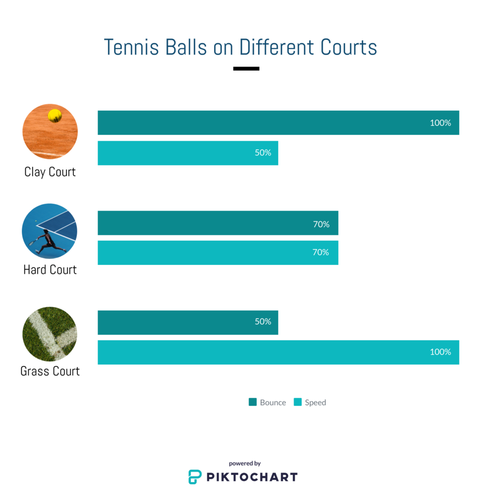
Learning Outcome: the learner is able to identify the different bounce and speed level of a tennis ball on three different types of tennis courts.
Intended Students: this graphic is suitable for all tennis learners at the beginner level.

Reference Theory
According to Dunlap and Lowenthal (2016), “effective infographics rely primarily on visual elements and structure, as opposed to text, to convey content/messages.” So, it is essential to spend a considerable amount of time considering the design of visual elements and make sure they precisely express the instructional meaning to the learners. I tried to use some templates from Piktochart, but I failed to find the proper one for my context. The graphic I created wants to present the different attributes (bounce and speed) a tennis ball performs in three courts. I utilized a horizontal bar chart to compare the three situations, and words and relevant images represent each court.
Three courts are sorted by bounce level from highest to lowest and speed level from lowest to highest. This design is supposed to help readers understand their changing patterns and help make connections and increase information retention. According to Balliett (2011), the graphics should not be used to “tell the story”; Instead, they should be used to show the data or information. That’s why I left a minimal number of texts in the infographic and try to present different graphics to show the instructional message.
However, when thinking about the question: “how can it be visualized?” This graphic might not be the best choice when taking the context–tennis–into consideration. I thought about using graphics of a tennis ball’s bounce height to present different types of courts, but apparently, it might take a longer time to produce it.
Using a platform like Piktochat has some limitations, like it might not be flexible enough or could not create detailed creations. But its advantages outweigh the disadvantages, especially for online educators. For instance, it provides many templates that are free to use, and most of them just need a few editing then ready to be used. The images I used in this activity are provided by the platform, and they are free to use.
References
Dunlap, J. C. & Lowenthal, P. R. (2016, September 8). Getting graphic about infographics: Design lessons learned from popular infographics. Journal of Visual Literacy, 35(1), 42–59.
https://doi.org/10.1080/1051144X.2016.1205832
Balliett, A. (2011, October 14). The do’s and don’ts of infographic design. Smashing Magazine.
https://www.smashingmagazine.com/2011/10/the-dos-and-donts-of-infographic-design/

Paul Chong
Hi Jun,
Nice infographic. A clean, minimal design. When I first viewed it, I wasn’t sure what the %’s had to do with. Only upon scanning it further I realized that it had to do with “bounce” and “speed”. I don’t know the limitations of the program, but it would be better to have the legend at the top and even more distinct colours to separate the two categories. I agree with your assessment that the advantages definitely seem to outweigh the disadvantage. If I knew it was this easy to create an infographic I would have went in that direction!
Junxiang
Hi Paul, Thanks for your comments. Yes, the platform has some limitations like I could not adjust the size of the text in the chart graphic. You are correct, moving the text at the top would make it easier to understand.
Grace Landreville
Hi Junxiang,
Great infographic, I learned something new from it. I always wondered why there are different types of tennis courts.
I like how you used a bar graph to convey the information with minimal text, very creative. I also think the order in which you chose to display your courts is well thought out. A suggestion would be to use a vertical bar graph, it might convey the message of “bounce” better.
Thanks for sharing!
Junxiang
Hello Grace, that was a nice one! I will try it in a vertical bar and see how it goes. Thanks for your advice!
Rolly de Juan
Hi Junxiang,
Thank you for sharing your infographic! It is straightforward and self-explanatory.
When I read from top to bottom, I could not figure what the percentages were until the very end. I suggest, placing that at the top.
Also, I suggest adding some more text to explain possibly demographics of each court, which courts are used in each of the grand slams, and how the surfaces are made and maintained?
Thanks again!
Rolly
Junxiang
Hi Rolly. Indeed, adding some tests explaining which courts are used in which Grand Slams would make it more informative. The percentage is not available in the chart I selected, maybe I can add them by using other platforms. Thanks for your feedback!